Getting started
Getting started with Strelit Layout is a breeze, but a bit of handholding is always nice. This tutorial takes you through the initial steps until you're up and running with your first managed layout.
Including dependencies
Strelit UI Kit v0.2.0 is engineered with modern TypeScript and ES modules. For standalone HTML integrations or rapid prototypes, include the primary bundle along with your preferred theme stylesheet:
<script type="text/javascript" src="https://strelit.dev/assets/dist/iife/index.global.js"></script>
<link type="text/css" rel="stylesheet" href="https://strelit.dev/assets/dist/css/strelit-base.css" />
strelit-base.css contains purely the structural layout bits, so you also
need a visual theme. Choose one of our curated themes and include its CSS file:
<link type="text/css" rel="stylesheet" href="https://strelit.dev/assets/dist/css/themes/strelit-dark-theme.css" />
For modern bundlers (Vite, Webpack, or Rollup), simply import the module and theme in your application entry point:
import { StrelitLayout } from 'strelit-ui-kit';
import 'strelit-ui-kit/dist/css/strelit-base.css';
import 'strelit-ui-kit/dist/css/strelit-dark-theme.css';
Configuring the Layout
Next we need to configure the initial layout (the user can move things around later). For this example we'll create a big component on the left of the screen and two smaller ones on the right, on top of each other, like so:
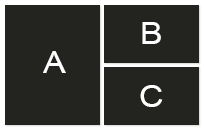
All Strelit Layout structures are created from three building blocks: Rows, Columns and Stacks. Row's arrange items from left to right, Columns from top to bottom and Stacks from front to back (as a tab-strip). These can be nested.
The actual parts that your app is composed of (forms, charts, tables etc.) are referred to as "components". Components can be put into any of these building blocks.
For our example we'll start with a row. The first item in this row is the big component that we want to put on the left hand side (A). To the right we want two components on top of each other (B and C) - so we need to put them into a column.
The whole structure should look like this:
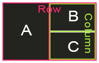
Or as Strelit Layout configuration
var config = {
    content: [{
        type: 'row',
        content:[{
            type: 'component',
            componentName: 'testComponent',
            componentState: { label: 'A' }
        },{
            type: 'column',
            content:[{
                type: 'component',
                componentName: 'testComponent',
                componentState: { label: 'B' }
            },{
                type: 'component',
                componentName: 'testComponent',
                componentState: { label: 'C' }
            }]
        }]
    }]
};
A few things to note about this config:
-
Every item (apart from components) can have children, specified in the
contentarray -
typecan be'row','column','stack'or'component' -
componentNamespecifies which component should be created. More about that further down -
componentStatecan be any serialisable Object and will be passed to the component
Instantiating the layout
Now it's time to instantiate the Layout with our config
var myLayout = new StrelitLayout( config );
myLayout.init(); later on.
The config argument is required. A DOM element or CSS string selector (e.g.
'#layoutRoot') can be provided as an optional second argument. If none is
specified Strelit Layout takes over the entire page by adding itself to
document.body
Registering Components
In our configuration we asked Strelit Layout to create a
'testComponent', now we need to specify what that is. This is done
using
myLayout.registerComponent( 'testComponent', function( container, componentState ){
    container.getElement().html( '<h2>' + componentState.label + '</h2>' );
});
This needs a bit of explanation. myLayout.registerComponent takes two
arguments: the name of the component and a constructor or factory function. This
function is called by Strelit Layout with new - which creates an instance
of your component if you've provided a constructor - or just executes the function
if not.
The function receives two arguments.
-
containeris an object that allows you to interact with the box that your component lives in. It gives you access to the DOM element, emits all sorts of events likeresize,hide,closeetc. and provides methods likesetSize()orsetState(). Read more about container here -
componentStateis what you've specified in the configuration, e.g.{ label: 'C' }
Your component's instance or whatever your function returns is stored and can later
be accessed from myLayout.
Initialise the Layout
That's it. Now all that's left to start up your layout is calling
myLayout.init();
Result
Here is the fully interactive layout running live in your browser. Feel free to drag tabs, tear them off, or resize splitters:
Community & Support
Need help or have architectural questions?
Whether you are building complex multi-screen trading terminals, enterprise data workspaces, or migrating from legacy layout engines, the Strelit UI Kit engineering team and community are here to help.
Open an Issue on GitHub →